Most web work gets handed off the same way. A link in an email, maybe a Loom video, a “let me know what you think.” The client opens it, feels vaguely like they should have opinions, doesn’t know how to say what they mean, and writes back “looks great!” because that is the easy thing to say. Then three weeks later the real feedback shows up, all at once, and nobody remembers what was on the page when.
I stopped handing off work that way a while ago. Here is what I do instead, and why I think it matters more than the website itself.
I build them their own review site
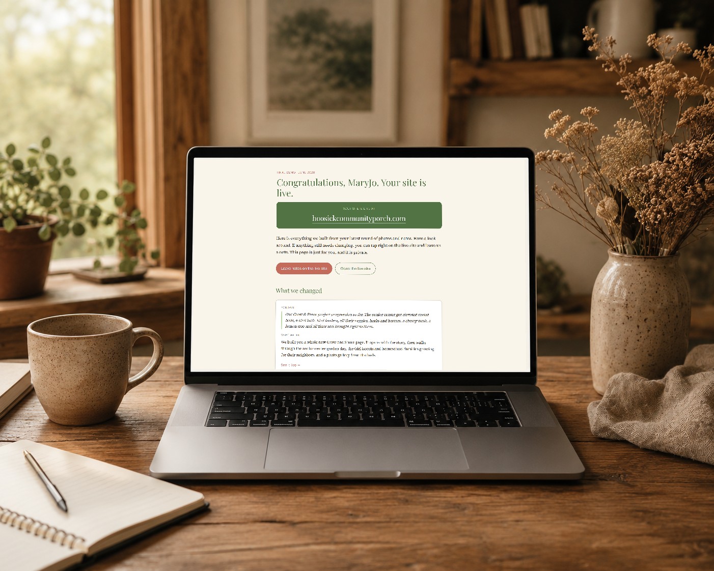
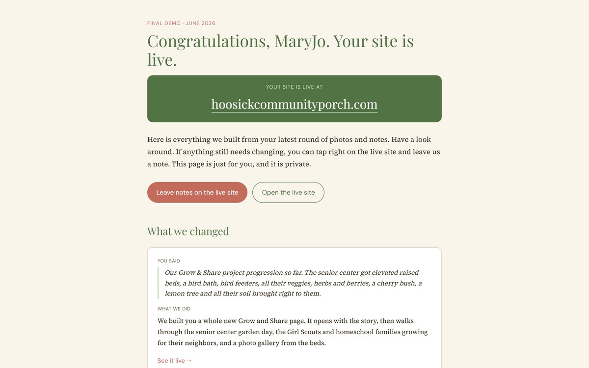
When a round of work is ready, I do not send a link to the live site and ask for notes. I build a separate page that belongs only to them. It opens with their name. It says, in plain language, here is everything we built from your last round of photos and notes, take a look around.
Then it shows the work the way they actually experience it. A “what we changed” section, written as paired notes: here is what you said, here is what we did. Their words on the left, my work on the right. No design jargon. No “implemented responsive hero treatment.” Just, you said the front of the building photo should be the one people see first, so we put it at the top.
It is a small thing. It also completely changes the conversation. The client is not staring at a finished site trying to invent feedback. They are reading a record of being listened to.
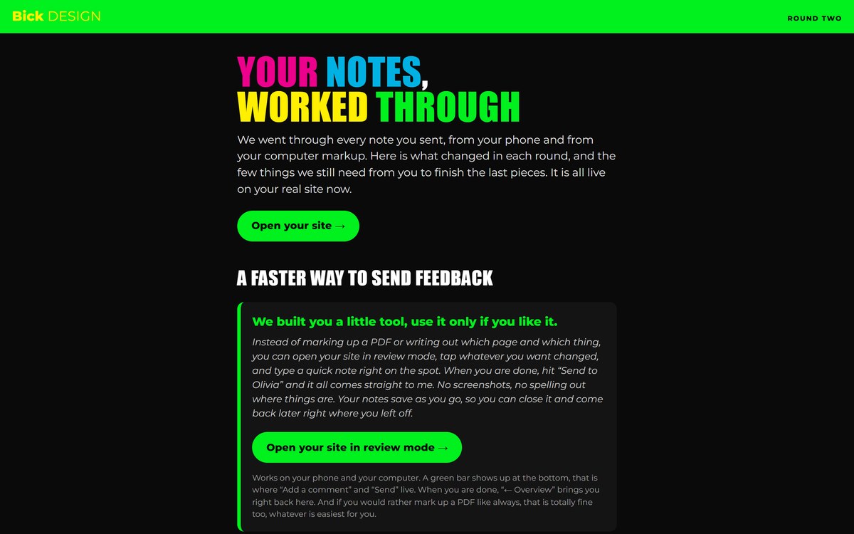
I wire a feedback tool right into their live site
The part I am proudest of is the review mode.
The best client I’ve worked with was sending edits the hard way. Screenshot every page, drop a text box on top, type what he wanted changed, page by page. He knew exactly what he wanted. The vision was always clear. The tooling just could not keep up with him.
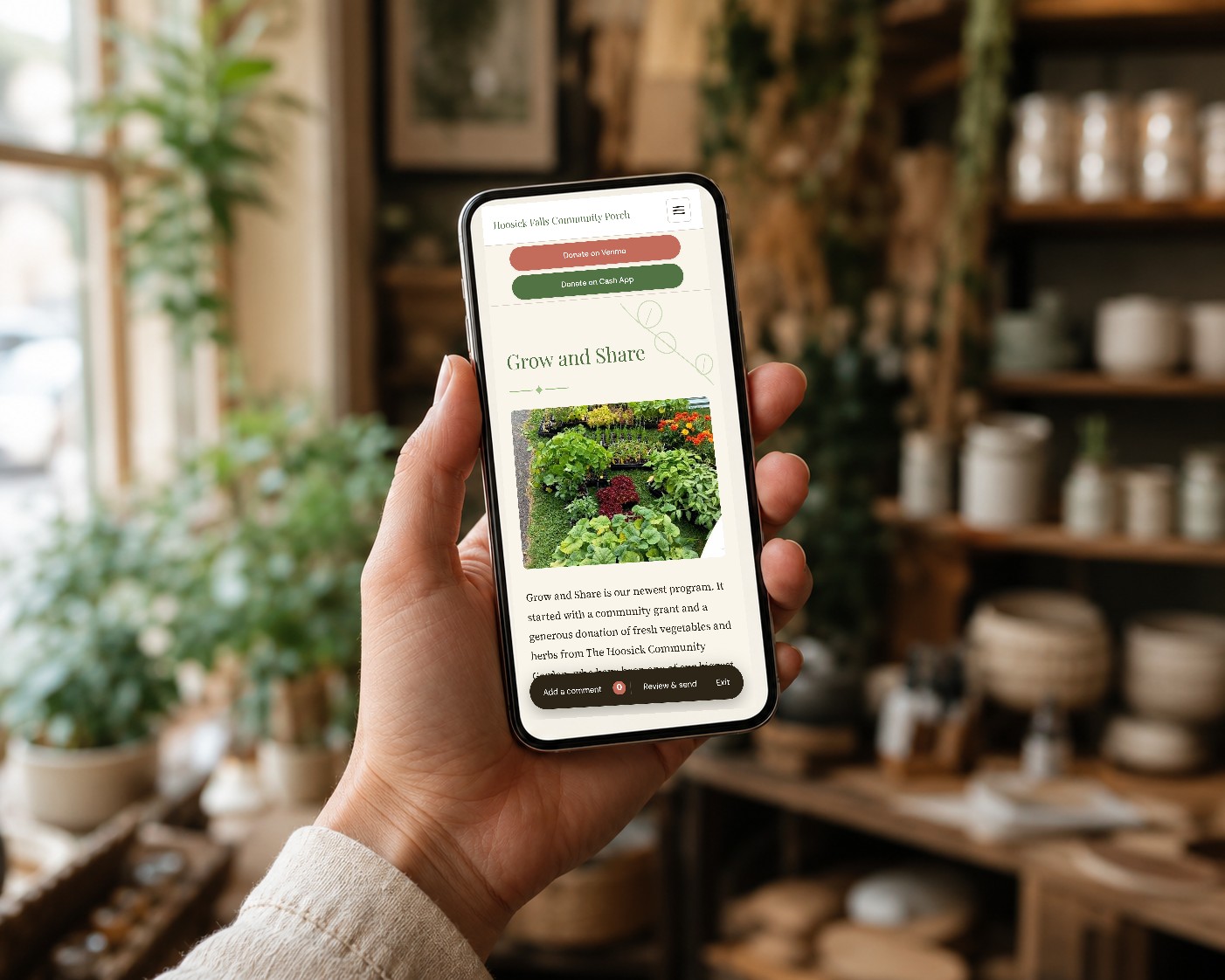
So now I build that exact tooling into every site. The client opens their own live site with review mode on. A little bar shows up at the bottom. They click anywhere on the page, a note box opens right where the change goes, they type, and they move on. Every note pins to the exact spot on the exact page. When they are done, they hit send, and the whole batch comes to me as one clean, ordered list tied to real locations.
No screenshots. No spelling out which page and which spot. No fifteen comments lost in an email thread. Their notes even save as they go, so they can leave halfway through making dinner or one of their own client calls and come back to the same spot later.
It works on their phone and their computer. If they would rather just text me, that works too. The tool is there if they like it but it’s never a hoop to jump through.
I make the whole thing feel like them
This is the part people underestimate.
I do not have a template I drop every client into. The review site, the demo, the feedback tool, all of it gets dressed in their brand. Their colors, their type, their voice. It’s for them and I want it to feel that way.
A community nonprofit’s review page sits on warm cream paper, soft serif headlines, moss green buttons, and reads like a thank-you note. A vending company’s runs on an industrial dark slate with bold condensed type and a header that looks like it belongs on the side of a machine. An art director’s is neon green on black, loud and colorful and a little unhinged, because that is exactly who he is and a quiet beige page would have been an insult to his creativity.
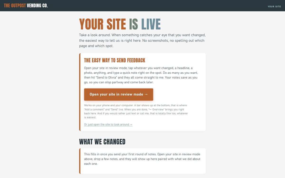
Same underlying tools. Three completely different experiences. When the client opens the page, the first thing they feel is recognition. That is theirs. Before they read a single word, they already know I paid attention to their business and their needs.
I wire the boring parts too
Every project has a “still need from you” list. The seasonal hours. The high-res logos. The photo of the actual building, not the stock one. Normally that lives in an email or Facebook messenger and half the time gets ignored.
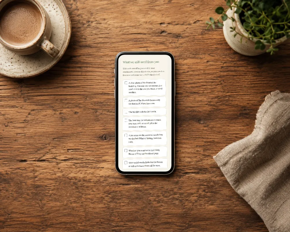
Instead of expecting them to find a way to get their information to me, I build it as a checklist on their review site, to make it as simple as possible. They tick things off as they send them, the checkmarks save on their device, and there is a real drop-box right there so they can drop the files without an account or a login. The list tells them exactly how many things are left. It turns the most annoying part of a project, chasing assets, into something they can knock out in five minutes between customers.
And I sign it
At the bottom of every one of these pages is one line. Built with care by Keiter & Co.
I think about that line a lot. It is not marketing. It is a standard I am holding myself to, in the writing, on every single thing I hand a client. If I am going to put my name on the bottom of the page, the page has to earn it. The demo has to actually work. The review tool has to actually save them time. The brand has to actually feel like them. If you want something to feel cared for, you have to genuinely care for it.
why i do all of this
Here is the honest reason. A website is marketing. It helps people find you and decide to trust you, and that matters. But the website is the smallest part of what I am actually selling my clients.
What I am selling is the experience of being a client. Of opening a page that knows your name. Of leaving feedback in ten minutes instead of an hour. Of seeing your own words quoted back to you next to the work they turned into. Of getting something that looks like you and not like a template with your logo dropped in the corner.
Big agencies cannot do this, or will not, because it does not scale. That is fine. I am not trying to scale. I am trying to make every person I work with feel like they got the most thoughtful, most squared-away, most clearly-built-for-them piece of work they have ever received. The kind of thing you screenshot and send to a friend, not because it is flashy, but because someone clearly gave a damn.
Built with care is not a tagline I put at the bottom to sound nice. It is the whole product. The website just happens to come with it.
find me on LinkedIn if the vibes feel right: linkedin.com/in/oliviakeiter
Leave a comment
Comments are reviewed before they appear. Email is optional and never published.